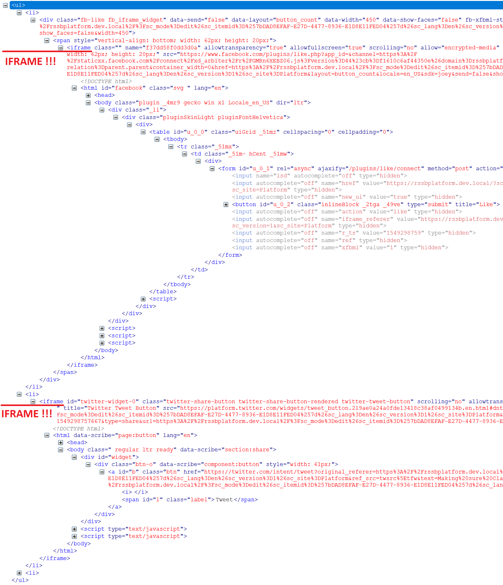
Introduction. Initially, I was going to implement social share buttons on my page. The first thing coming into my mind was to use existing share components coming OOB with SXA. That's what I did and it looked well.. until I viewed generated source. It looks quite monstrous, includes iframes, inline JavaScripts and in general brought customization issues for my front-end developers. Here's how 2 of 3 buttons look like when rendered (3-rd is collapsed):
In general, that looks sort of over-engineering for given requirements. The code suggested by my front end developers looked more-less elegant like this:
<div class="social-block">
	<span class="social-block__label">share this</span>
	<ul class="social-block__list">
		<li class="social-block__item">
			<a href="#" class="social-block__link social-block__link_facebook"></a>
		</li>
		<li class="social-block__item">
			<a href="#" class="social-block__link social-block__link_twitter"></a>
		</li>
		<li class="social-block__item">
			<a href="#" class="social-block__link social-block__link_linkedin"></a>
		</li>
		<li class="social-block__item">
			<a href="#" class="social-block__link social-block__link_mail"></a>
		</li>
	</ul>
</div>
Definitely much nicer and cleaner, given that sharing functionality provided by many social platforms can be implemented just in a form of a link (ie. //www.facebook.com/sharer/sharer.php?u=https://your-site/page-to-share), so that can be simply passed with href attribute of anchor tag.
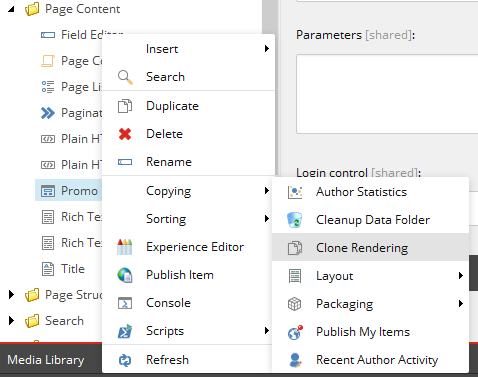
Implementation. Based on that, I decided to implement my own Share buttons component. Of course, unwilling to create a new component from a scratch, I decided to take a look on existing with a purpose of cloning it. There were 2 requirements while picking the right component to clone: 1) it should support rendering variants and 2) it should work with datasource template, so that those are also cloned. It looks that Promo component fits the purpose well, so here we go, by using an SXA built-in clone script available from a context menu:
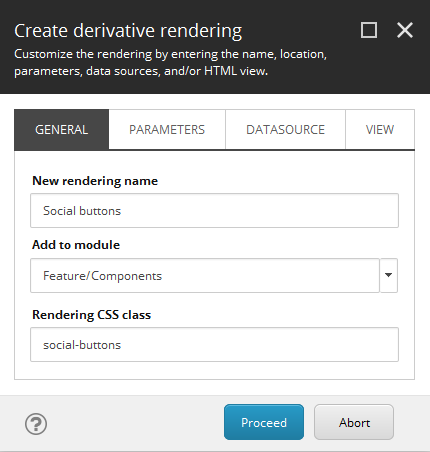
By that moment, I already have my custom module named Components, sitting outside of Experience Accelerator folder, that will likely be overridden by next version update, and where I separate my custom controls. So, in the following dialog, name the component, state where you want to put it and also give the name to CSS class to be used with it.
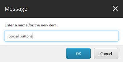
I called my new component Social buttons, so that I will make two rendering variant as the part of it: one for sharing current page over social networs, and another will be called Social presense simply leading to my company's social network accounts. I also named CSS class social-buttons:
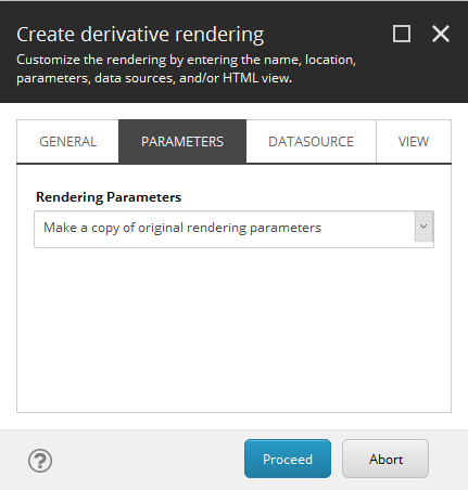
Also, in order to be able to provide some defaults, I also make a copy of Promo's rendering parameters under a new name, so that I could adjust it later according to my requirements:
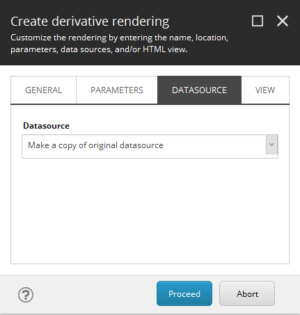
And also copying datasource:
And finally, to make my new component even more isolated from its donor, I copy the rendering view file as well:
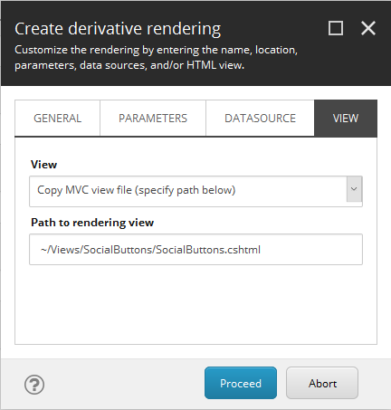
It is not mandatory, you may keep using existing control rendering. However, In my case I do want to modify HTML structure, to get rid of nested <div class="component-content"> elements, so I select "Copy MVC view file (specify path below)" option.
Note 1: before you start cloning component, make sure ~/Views/SocialButtons target folder exists, otherwise script errors out. Also, once done don't forget to copy cloned rendering into your working folder so that you include it into solution and add to the source control (somewhere similar to src/Feature/Components/code/Views/SocialButtons/SocialButtons.cshtml as in my case).
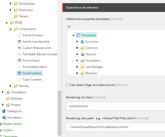
Note 2: just to remind, that rendering view, CSS class name for the component and other settings can be adjusted later at the Experience Accelerator section of rendering item:
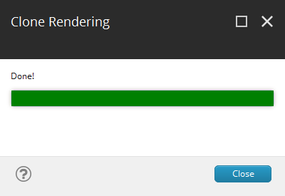
Click Proceed and when complete, you see successful result confirmation:
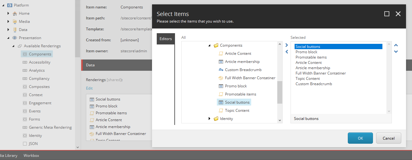
Once clone script finished, we may also want to add new component into the toolbox. To do so, navigate to Presentation - Available Renderings, find the desired module and add a new component into it:
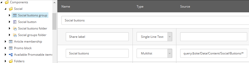
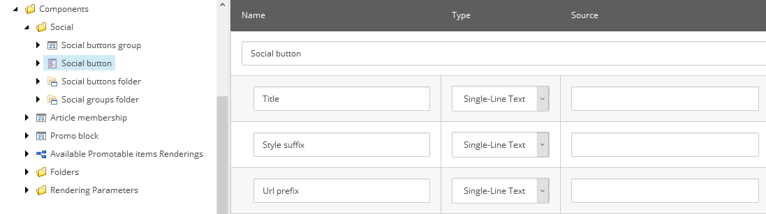
I made few more changes - renamed Social buttons into Social buttons group as it makes more sense, and made item and folder templates for buttons.
Here's what I got under feature templates for Social buttons group:
and for Social button:
You may also notice two correspondent folder templates to create folders for storing items of these new types.
These were feature-layer templates, but there's one more project-layer interface template to be appended to page types inheritance:
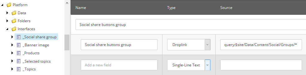
So now, under Data folder I can create social buttons and a social share group based on (some of) these buttons. I made just one and called it Default.
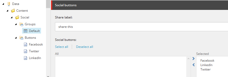
From this moment, adding _Social share groups interface template into an inheritance of some page templates adds a section with an option of selecting a social group for all pages of these type. You may also customize label (and if) shown next to social buttons.
Usage. Here we carry on. After adjusting placeholder settings, you added a new component to a page, then selected appropriate datasource but nothing appears as the result. This comes due to a component supporting rendering variants, does not have any single variant availability. How comes that?
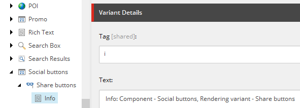
Note 3: the clone script does not clone rendering variants (at least per SXA version 1.8), so you need to create at least one. Remember that when creating new Variants item (or duplicating an existing one), the name should be the same, as the name of the corresponding rendering:
Insert at least one Variant Definition.
Note 4: the way rendering variants work it the first Variant Definition in the list becomes default one, if not set explicitly. I called variant Share buttons and added Info field so that it becomes visible on partial design in Experience Editor straight away (I explain Info field trick in more details in this article).
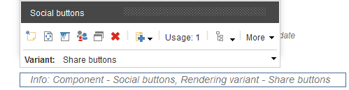
At least component shows up in Experience Editor as:
Now being aware that right component with right rendering variant presents on a page, I can carry on implementing that variant according to my desired output.
Note 5: these buttons are not subjects to changes by content editors from within EE, rather they are configured by the site setup. That's why links should not be editable so I can use template variant field in order to render anchor tag precisely as per our requirements.
Creating rendering variant. This is how I implemented Share buttons rendering variant:
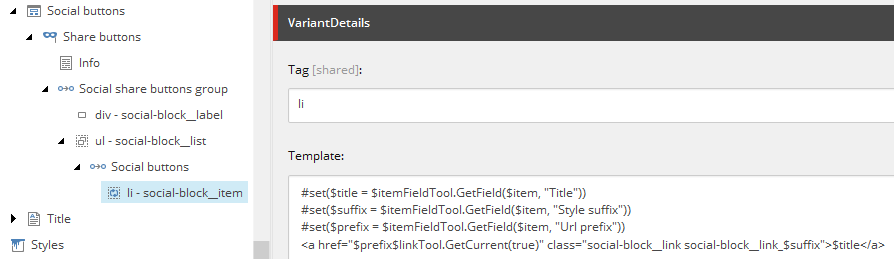
Few things I'd like to explain about the way it is structured and how it works.
1. Naming conventions. instead of giving sections generic names, I am following "Element - Class" approach. Of course, it would make much sense from interpreting the point of view to name them "Element.Class" as CSS selectors normally do, however using dot is not allowed to be used for Sitecore item names by default while explicit setting that value for display name is an exhaustive waste of time. In any case, it is clear what element renders to.
2. You may notice, that I am having two reference variant fields, one nested into another. The way it works is that it contains the name of a field from a context item, that has a link to another item (or items). Thus, it switched context so that all nested field will be executed in the context of that "proxied" item.
3. NVelocity template (pictured above) is the very powerful way to extend rendering variants functionality far beyond out-of-the-box variant fields, employing the power of custom C# code, pre-built tools or creating your own. In one of my previous posts, I mentioned SXA built-in token tools to be used with rendering variant templates, so I am using the one already have in my solution, but if you haven't - these 2 snippets would be the only piece of your C# code to implement. Link Tool:
public class LinkTool
{
    public static string GetItemLink(Item item, bool includeServerUrl = false)
    {
        var options = UrlOptions.DefaultOptions.Clone() as UrlOptions;

        if (includeServerUrl)
        {
            options.AlwaysIncludeServerUrl = true;
        }

        return LinkManager.GetItemUrl(item, options);
    }
    public static string GetCurrent(bool includeServerUrl = false)
    {
        var item = Sitecore.Context.Item;
        return item == null ? String.Empty : GetItemLink(item, includeServerUrl);
    }
}
and ItemFieldTool below:public class ItemFieldTool
{
public static string GetField(Item item, string fieldName)
{
ReferenceField field = item.Fields[fieldName];
return field?.Value ?? String.Empty;
}
}
The payload, however, is lack of ability to edit anchor tag, as I mentioned in Note 5 above. But, that should not surprise, given that you see that it is being calculated on a fly from different sources. GetFieldTool reads field value of a context item, where context has been changed twice already, in this case, a variant is iterating through the list of Social buttons and $item relates to Social button item.
#set($title = $itemFieldTool.GetField($item, "Title"))
#set($suffix = $itemFieldTool.GetField($item, "Style suffix"))
#set($prefix = $itemFieldTool.GetField($item, "Url prefix"))
But how do I get a something from the context of an initial item, before "tunnelling" two times through references? The code behind tools is being still executed in Sitecore.Context which means access to page item, so I implemented GetCurrent() method that returns full URL of context page. I use it for appending to URL prefix of a social button. $linkTool.GetCurrent(true)
Getting result. Finally, after opening exact item in Experience Editor (and not the partial design edited previously that does not wire to actual data), I am getting expected share links rendered, with correct URL:
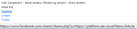
and after applying CSS styles on a published site, Info Field scaffolding is not shown and we see nicely applied social share buttons:

This is a flexible approach allowing to configure individual buttons set per each page template by standard values with an option of overriding the default for specific page individually.
That was a walkthrough of creating new components with (almost) no new backend code written. You learned how to create custom components by cloning existing, how to create rendering variants, how to use reference fields to "proxy" the context and NVelocity templates from within rendering variant.
Hope it helps!